Have you noticed that most of the blogs out there are using not very interesting stock photos downloaded from the internet?
That’s the reason I want to show you how to make your blog stand out in the crowd.
How? The answer is simple. One way to do it is to design your images!
Truth be told, it is fast and easy to accomplish. If you follow these simple instructions, you can design your cool images in just 5 minutes.
If you knew how to make $1200 a month online, from the comfort of your home, would you do the work?
…Well THIS is your chance
It’s FREE to get started, too (no credit card required). You’ll like that part…
1. Tools you need
1. You need some cool fonts. If you don’t have them already, here’s my tutorial, how to find cool free fonts and install them.
2. You need image editing software. Even though Photoshop is the best one, it is not free. Gimp is an excellent alternative to Photoshop, and it is free, but it is big and opens slowly. So my #1 choice for this task is Paint.net, which is free and also fast. If you don’t have your favorite image editing software yet, go to their free Paint download page and get the program.
3. And finally, you need some background images. Even though there are tons of images online, most of them are not free to use. Later on, I suggest you use only those images that are free to use to avoid copyright problems. There are quite a few places that offer free photos online. One of those is RGBstock.com. Just register yourself, find whatever you like, and download it. You may also want to check Flickr, Stock Xchng, Freefoto, all offering free photos.
2. Design your image in 5 minutes
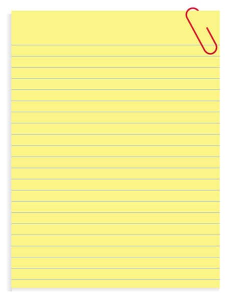
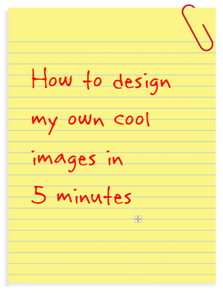
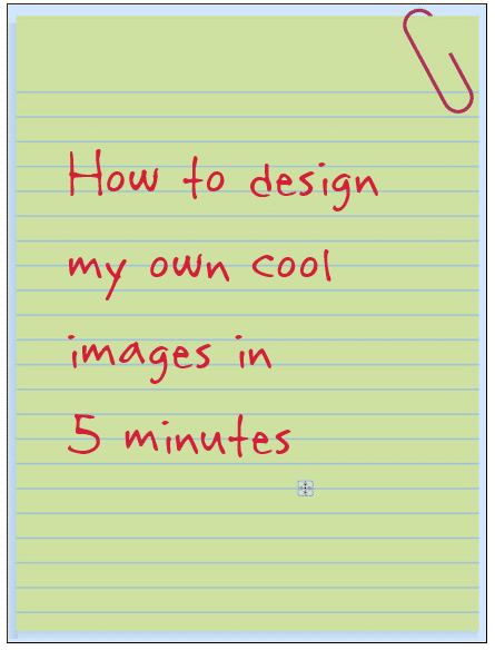
1. For this example here I have downloaded this image for a background:
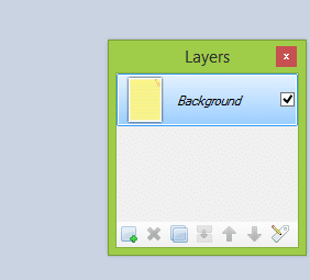
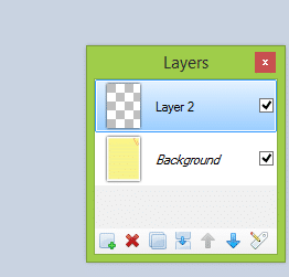
2. Open your background image in Paint.net software. At the bottom right corner, you see a small Layers window. It shows that you have only one layer at this point, which is where your background is.
Because you work with a bitmap image, then if you do something here or write something on it, the original pixels will be overwritten with different colors, and you cannot change it later. So it is better to make a new layer for the text and type your message on it.
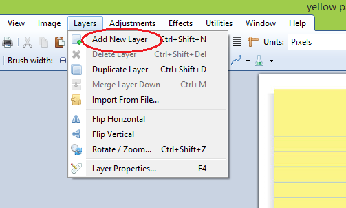
3. At the menu above, click on Layers, and from the drop-down menu, choose to Add new layer:
You see that in the Layers window, another layer is added. Now you have two layers: Background and Layer 2:
The icon of the second layer is like a chessboard. It means that the whole layer is transparent. It’s like a transparent film has been added above the original image.
Why do you need it? Instead of writing your text right on the image (overwriting the pixel colors of the original image, which you cannot modify later), you instead want to write it on that transparent film:
4. Ensure the second layer (in our case, Layer 2) is selected as you want to write on it.
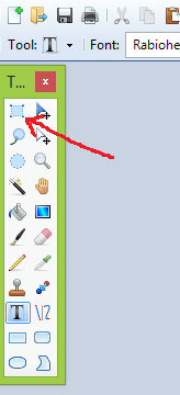
5. Choose the Text tool from the tools window:
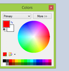
3. Put the cursor somewhere in the middle of your image, choose your cool font style and size. You may also want to change the color of the text if you wish. For this, use the Color Window at the bottom left.
5. Type your text. If your text is too small or big, don’t worry about it right now. You can change it later:
Even though you see the text in the background, in fact, it is written on the second layer – on that “transparent film” that you cannot see. But it is there.
6. After finishing with the text, you want to change its size, position, and writing angle. To do that, you use the Rectangle Select tool:
6. Select the text. But select it so that the whole background image is covered. It gives you more space to move and rotate your text later. Note! Make sure the second layer is still selected.
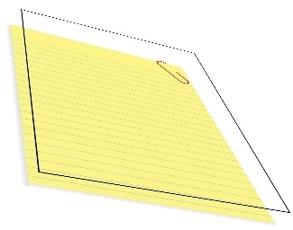
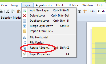
7. Now, you may want to move your text into a better position and give it some writing angle. To do this, open the Layers drop-down menu again and select Rotate/Zoom tool:
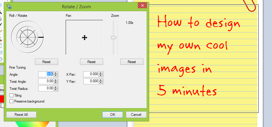
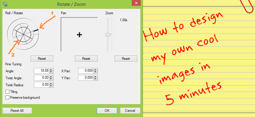
8. Click it, and you see a new window. Drag it away from your image so that you can see the image below:
Here you have three tools that you may want to try:
9. Roll/Rotate tool (left) – It gives you two options as shown on the image. Grab those handles and move into a different position and you see how the text changes its angle accordingly.
10. Pan tool (middle). – Use this tool to change the position of the text.
11. Zoom tool (right) – Use this tool if you want to make your text bigger or smaller.
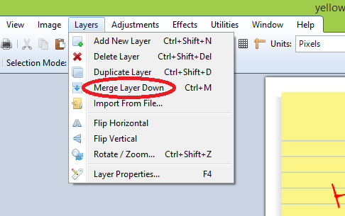
12. Once you are happy with your image, merge these two layers into one. Just click Layers and then Merge Layer Down:
Merging layers means that the original image’s pixel colors (background, in this case) will be overwritten, and you cannot change your text (size, position, angle) anymore.
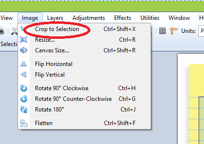
13. Finally, you may want to crop the image. With the Selection tool, select as much as you want for your final image. Then click Image and then Crop to Selection:
14. Change the size of the image. Because you want to use your photo in your blog post, the file size must be small enough. There are different ways to reduce file size, but one of the easiest ways is to give it a proper size.
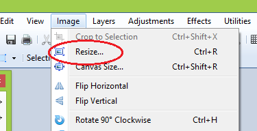
On the menu, open Image and then Resize:
It opens a new window where you can resize your image. The background you downloaded from the internet might be too big, making your file size also big. This, of course, makes your website speed slow. So you want to be sure your files have good quality with the smallest size.
As you see, the “Maintain aspect ratio” is already selected. It means that you only need to change the width. If the image’s width is bigger than 1000 pixels, the picture is clearly too big for your blog post. You have to reduce its size. Anything between 300 to 700 pixels is sufficient.
My suggestions to choose the width of an image:
a) Use 300 pixels if you need quite a small image.
b) Use 700 pixels if your image is rather wide and you want it to be as wide as your text lines on your post.
c) For average images, anything between 400 and 500 pixels is OK.
14. Save your final image as a .jpg or .png file:
It was my choice to crop it that way. It was to give you an example. You may want to leave your image bigger if you want. It is up to you.
3. Conclusion
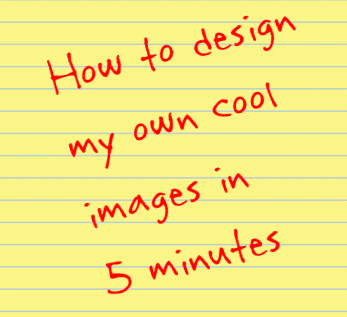
As you see, it is not difficult to design your own images. Once you feel more comfortable with the image editing software and its tools, it takes just minutes to put together your cool photos. You already have the fonts and the software. Just download the image you want to use as a background image and put your text on it.
What is more important, this way, you can give your blog a cooler and more personal look. So the only thing you need is some cool background images and some cool and exciting fonts. And remember this – handwriting draws more attention than photos. This is why it is wise to use fonts that imitate handwriting.
What if I could show you a real system you can use to put $1,200+ per month into your account, working from the comfort of your home…
…Would you be interested?
Yes, the raw, sizzling beauty of passive income stream online. So click here now. Sometimes ‘later’ becomes ‘never.’
What About You?
What are the other ways that you can design your images fast? Please let me know by dropping a comment below. Thank you very much :)
You may also like:
Make your blog FREE!
How to install fonts on windows 7/Vista/8





 ARE YOU looking for ways to create a legit passive income online?