In my previous two posts, I showed you how you can optimize your website sidebar for traffic and conversions; and How you can quickly and easily add a “Follow Me” Twitter button to your WordPress blog.
So today, I want to discuss a website footer. More precisely, what to include in the footer to optimize it for maximum impact.
Before diving into the details, though, let me tell you why optimizing a website footer is essential?
Your website footer is the last port of call for many readers. Therefore, you may want to ask yourself – what do you want your readers to do when they reach there. If this is some Call-to-Action, add it to your footer.
The cheapest, easiest, and fastest way to improve your blog footer is to learn from other success stories. Do you agree?
If you knew how to make $1200 a month online, from the comfort of your home, would you do the work?
…Well THIS is your chance
It’s FREE to get started, too (no credit card required). You’ll like that part…
So let’s do just that. Learn and apply.
What to Include in Footer – Most Popular Footer Designs
These days websites use widgetized footers. It means that usually, a footer has two primary layers:
- Widget Areas – this is the central area of a footer, which is generally divided into a different number of columns.
- Footer Text area – the very bottom of the page. This is where you typically find necessary information like copyright notice, privacy policy, disclaimers, etc.
Let me give you two typical website footer examples here:
Example #1:
Dan Schwabel (Top 29 social media power influencer) has designed his blog’s footer like this:
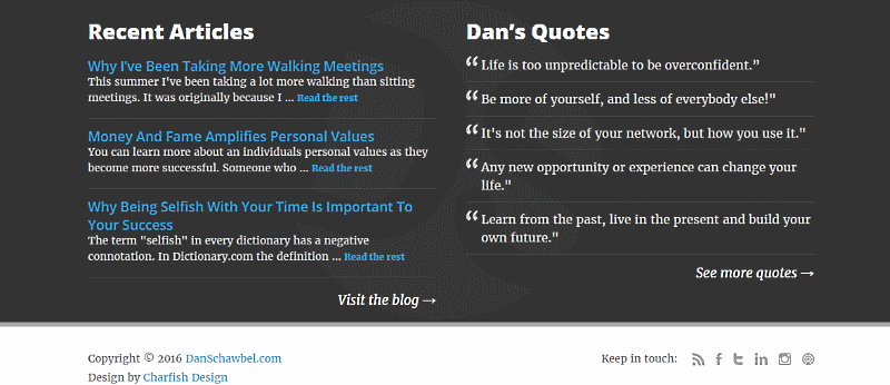
As you see, the danschawbel.com blog’s footer has two widget areas (the columns). The footer text (with a light background), has a copyright statement and design notices on the left and social icons on the right.
Example #2:
Darren Rowse’s (Top 15 social media power influencer) Problogger blog has three widget areas:

Problogger’s Footer Text area includes copyright information on the left and Navigation on the right:
Adding Data to Footer in WordPress
WordPress themes usually provide you easy access to adding data to primary footer layers.
Just log in to your WordPress Dashboard, then navigate to Appearance → Customize→ Footer. That’s where you will find the place.
Here you can determine how many widget areas (columns) you want to include in your footer. Also, type in your copyright statement.
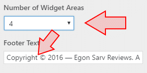
My theme – WPZoom Diamond (a brilliant theme indeed) allows up to 4 widget areas.
What to Include in Footer – Multilevel Footers
Sometimes, the standard footer layout is not enough, though. Often, bloggers want to put more components into their footers. That, of course, requires additional footer layers, as you see in the image below.
Swedish software company Cision gives us one of that excellent website footer examples (Forbes, by the way, recommends their content marketing blog):
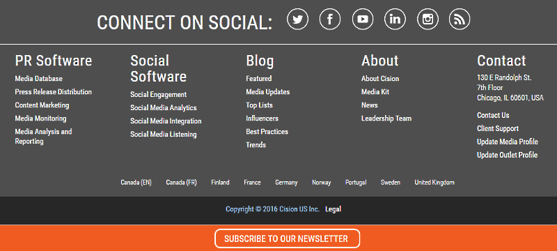
Their footer is neat, elegant, and clear as a clear sky, isn’t it?
So let’s take it apart and see how their footer design looks like.
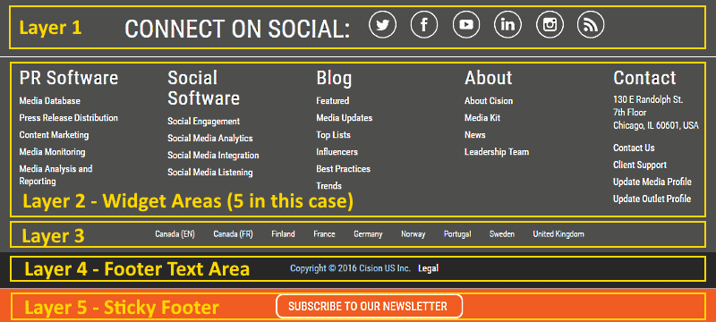
See! Layer #2 has five widget areas. And layer #4 (footer text) includes the copyright statement (aligned center).
Cision, however, has added three more layers to its footer. As you notice, they have lapped an extra layer above these five main widget areas. This layer is for social icons. Looks brilliant.
Just below these five columns, though, there is another layer for the company’s local branches. And at the very bottom of the page, there is a sticky footer with a Call-to-Action button (the orange bar).
Sticky footer, if you did not know, is a type of footer that is always there, no matter the scroll depth.
In this post, I am not going to show you how to add these extra layers and sticky footers, though.
My goal here is to demonstrate to you how the top-notch bloggers in the world have designed and optimized their footers for SEO and sales.
So by now, you know the main parts of website footer design, and it’s time to focus on its components.
What if I could show you a real system you can use to put $1,200+ per month into your account, working from the comfort of your home…
…Would you be interested?
Don’t wait the right moment to start a business. It never arrives. Start whenever. Now.
Next stop:
What to Include in Footer – A Component List
I am almost ready to come to my blog footer case study: How 70 top-level bloggers have designed their footers.
Before that, though, let me start with a list of some of the most popular footer components.
Scroll through the list, and you get the idea what bloggers and businesses usually put in their footers:
- Awards and Certifications
- Branding
- Contact (postal address, phone number, Email)
- Copyright Information
- Email Signup
- Image (Profile image)
- Navigation (Main Menu)
- Popular Posts
- Privacy Policy
- Recent Posts
- Search tool
- Sitemap
- Social Icons (Follow Me)
- Social Media Widgets
- Terms of Use
- Testimonials
- Upcoming Events
See! It’s a long list. However, it’s not wise to cram all of them in. That’s why it’s important to know what works best and in what place. In other words, how to optimize a footer for SEO and sales?
Case Study: What Top-Level Blogs Put in Their Footers
Let’s do numbers.
I tested 59 first-rate blogs in the world:
- 44 of them are the blogs of the Top 50 Social Media Power Influencers.
- The other 15 come from the 20 Best Content Marketing blogs recommended by Forbes.
You can learn from them a lot, can’t you?
Onward.
Four blogs (6.8%) out of these 59 had no footer. So what about the remaining 55?
Well, that’s what I’m going to show you next. Keep reading.
To make it easier to understand, I take it layer by layer.
Our first stop is:
1. An Additional Layer Above the Widget Areas (columns)
Eight blogs (14.5%) out of the 55 tested blogs with footers have an extra layer above the widget areas.
For example, Dan Zarella (Top 48 social media power influencer) blog footer has Social Icons in this field:

Below you see the upper layer of the Inbound Marketing Agency (PR 20/20) blog footer:

Now, what about the other tested blogs?
Most common components in that upper layer are:
- Social Icons: 3 times
- Navigation (horizontal menu): 2
- Logo: 2
- Email Opt-in: 1
- Copyright: 1
Almost always, the components are aligned center. Only Moz.com uses left-right alignment. MOZ logo and Navigation are aligned left, and the copyright statement is aligned right:

By the way, this was the only time I found copyright so high in a footer.
2.Widget Areas (the Columns)
This seems to be one of the most important areas of widgetized footers. Jeff Bullas’ Blog (top 7 social media power influencer), for example, uses four widget areas in its footer:

However, nine blogs out 55 (16.4%) have decided NOT to use these widget columns (After all, it’s not required, is it?)
Danah Boyd’s blog Zephoria (Top 44 social media power influencer) has no widget areas in its footer:

What about the other 46 blogs?
- 1 column: 11 times
- 2 columns: 4
- 3 columns: 15
- 4 columns: 12
- 5 columns: 3
- 6 columns: 1
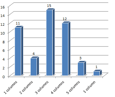 See! The most popular website footer designs include 3 and 4 widget areas, followed by one single (center aligned) column.
Example #1:
Mari Smith (top 4 social media power influencer) blog footer has four widget areas:

Example #2:
Steve Farnsworth’s (top 27 social media power influencer) blog Steveology has one single widget area for Email opt-in:

The next obvious question is, what are the most popular components in these columns?
Here are my findings:
- Social Icons: 17 times
- About: 14
- Email Opt-in: 11
- Navigation: 11
- Resources: 10
- Logo: 9
- Branding: 8
- Social Widgets: 8
- Contact: 7
- Products: 7
- Categories: 6
- Copyright Statement: 6
- Postal Address: 6
- Designed by/Powered by 5
- Search: 4
- Archives: 3
- Events: 3
- Featured: 3
- Join Us: 3
- Popular Posts: 3
- Services: 3
- Blog: 2
- Hire me: 2
- Privacy Policy 2
- Profile Image: 2
- Recent Posts: 2
- Calendar: 1
- Contact form: 1
- Pricing: 1
- Sitemap: 1
- Terms of Use: 1
There were other, more specific components, which occurred only once. My aim, though, was to show you the most popular things in these columns.
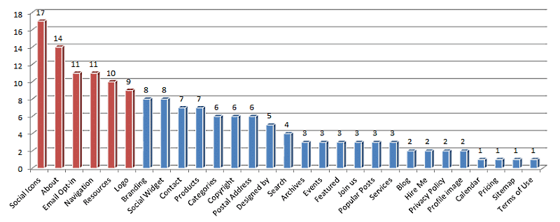
See! The emphasis pops quickly out here:
- Social Icons, Email Opt-in, and Social Widgets are there to build one’s tribe.
- About, Logo, and Branding introduce the business and build trust.
- Navigation, Resources, and Categories keep visitors on the site longer while making navigating smoother.
3. A Footer Text Area
Finally, the very bottom layer of a footer is a Footer text.
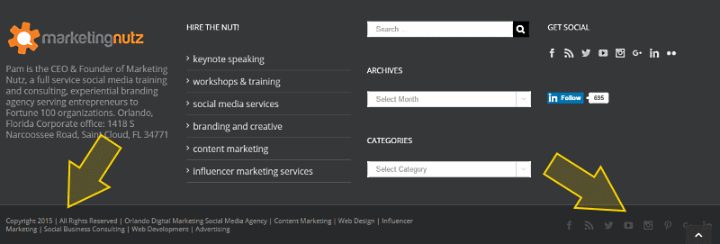
At the image below, you see a footer (and footer text are) of the Marketing Nutz – the blog of Pam Moore (Top 12 social media power influencer):
So, what are the most familiar things in a footer text? Let’s do the numbers again:
13 blogs (23.6%) leave the footer text area empty. You can do this if you want, right?
Well, what about the other 42 blogs?
Here are my findings:
- Copyright statement: 36 times
- Privacy Policy: 11
- Designed by: 10
- Social Icons: 9
- Navigation: 8
- Terms of Use: 8
- Powered by: 7
- Contact: 4
- Email Opt-in: 3
- Logo: 3
- Product ads: 2
- Back to Top: 1
- Home: 1
- Postal Address: 1
- Refunds and Cancellations: 1
- Sitemap: 1
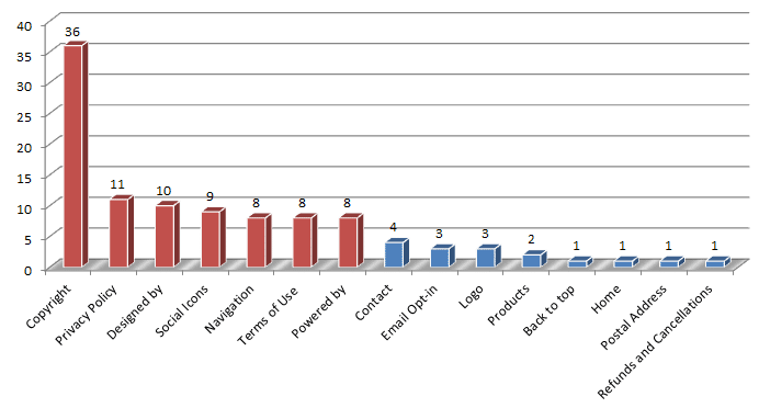
It’s pretty clear, isn’t it?
These top-notch bloggers put into the footer text:
- Essential but not immediately vital information:
- Copyright Statement, Privacy Policy, Terms of Use.
- ‘Designed by’ and ‘Powered by’ links
- Social Icons and Contact (if not used already in the upper layers of the footer)
Bottom Line
By now, you should have a clear understanding of how to design a website footer and what to include in it. And what are the most popular things in the upper layer if you decide to use it. And also, what are the most popular components in the Widget areas (the columns).
And finally, you also know what to put into a footer text area.
Following the trends described above, you surely can optimize your website footer for SEO and sales.
Imagine for looking for legit work-from-home opportunities and finding THIS when you go inside… WOW
Yes, the raw, sizzling beauty of passive income stream online… Look closer now. Because sometimes ‘later’ becomes ‘never .‘
What About You?
Now you should know how to design your footer and what to include in the footer. What are your thoughts on the topic – how to optimize a footer for SEO and sales? Please drop me a comment below. Thank you :)


 ARE YOU looking for ways to create a legit passive income online?
Hi Egon,
I really wish I would have had this when I was first starting out. I think you broke everything down in a way that was very easy to understand. Thank you for that.
Also, I really like the layout of your site and it looks clean and professional. Great job and I wish you the best of luck in the future!
Thank you for your generosity, Alec. I am happy to hear you found the post useful. I like simplicity and my aim here is to help newbie bloggers. I know full well how frustrating it can be when you don’t understand what to do or how to do. That’s why I try to keep things as simple as possible.
Thank you again for your feedback and kind words, Alec :)