Have you ever wondered if you could maximize your blog’s sidebar efficiency? And if you could, what widgets should you include? Also, how many widgets and in what order?
To figure out how to improve a website sidebar design, I did some research on the topic. In this post, I am going to show you how you can optimize your sidebar to get the most out of it.
If you knew how to make $1200 a month online, from the comfort of your home, would you do the work?
…Well THIS is your chance
It’s FREE to get started, too (no credit card required). You’ll like that part…
Why Use a Sidebar, to Begin With?
A sidebar is not just an ornament to give your blog some more charm. It plays a crucial role in your SEO campaigns and profits.
How?
Let me give you just two examples here:
1. When visitors click on links in your sidebar, your site’s Bounce Rate will decrease. Lower bounce rate tells Google that people like your content (they hang around and don’t want to leave).
Therefore, Google will increase your site’s ranking. Apparently, a higher ranking means more traffic, and more traffic means more significant revenue.
2. Let’s say you have placed certain Calls-to-Action (CTA) in your sidebar. Because, obviously, you want to get your visitors to do something – to hand over their email, read your most popular post, download your exclusive guide, buy your book, etc.
Some of these Calls-to-Action bring you instant revenue while others keep visitors on your site a bit longer.
And here’s the kicker:
The more of your reader’s time you attract, the better chance you have to sell them something.
That’s why the Website Sidebar Design is so crucial.
Can You Increase Profits by Ditching the Sidebar?
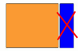 What?
What?
Wait. Let me explain:
I have noticed that an increasing number of prominent websites have opted to use blogs without a sidebar.
Really? Really.
So I asked myself, “Why?”
Interestingly, I found quite a few articles supporting the idea. They proved that after ditching their website sidebar altogether, the conversion rate of that particular website…
Increased!
Therefore, you might want to consider that option too (of getting rid of your sidebar).
This article, though, is not about ditching a sidebar but optimizing it.
Keep reading, and I will show you how.
What I did was I took the blogs of all top 50 social media power influencers. And, I added to that list another 21 top content marketing blogs in the world, a majority of them recommended by Forbes.
This makes a total of 71 top-notch blogs. That number satisfied me as I would get a pretty clear picture of what works and what does not.
Now here’s what I found (my findings):
1. Website Sidebar Design – What Should You Include?
To answer this question, let’s do the numbers.
Obviously, all the top blogs recommended by Forbes are… Blogs. Aren’t they?
What about these Top 50 Social Media Power Influencers? Well, almost all of them run a blog. There were only four influencers whose blog I could not find (maybe I did not try hard enough).
Anyway, that brings the total number of blogs down to 65.
Blogs without a sidebar
Out of these 65 blogs, 12 opted to run their blogs without a sidebar. It’s a whopping 18.5%!
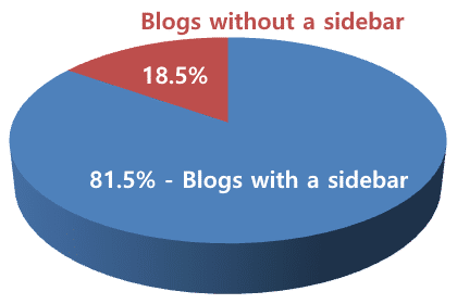
It should make you think, “Should I ditch my sidebar too?”
Well, what about the remaining 53 blogs with sidebars?
First, out of these 53 blogs with sidebars, only 4 used a sidebar on the left side. All others used it on the right.
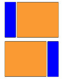
Here’s an excellent article that sheds light on whether to place your sidebar on the left or right side.
What if I could show you a real system you can use to put $1,200+ per month into your account, working from the comfort of your home…
…Would you be interested?
Don’t wait the right moment to start a business. It never arrives. Start whenever. Now.
Onward.
In the following list of sidebar widgets you will see how many times each widget appeared in my 53 tested sidebars:
- Email Opt-in Box – 32 times
- Social Icons (Follow Me) – 29
- Search Bar – 23
- Categories – 19
- Archives – 16
- Recent Posts – 15
- (Most) Popular Posts – 14
- About – 13
- Video Ads – 11
- Helpful Resources – 8
- Profile Image – 7
- Guides – 6
- Contact Me – 3
- Recent Tweets – 3
- Tags – 2
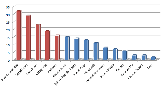
Evidently, bloggers have sprinkled plenty of ads (total 63) into their sidebars too.
Now, apart from these ads, let me ask you:
Did you get the picture? Do you see a common trend here? Can you name five sidebar widgets that the top-notch bloggers have considered as most important?
Email Opt-in Box, Social Icons, Search Bar, Categories, and Recent Posts, right?
Now, let’s analyze those most valuable widgets in the list above:
3 Distinctive Groups:
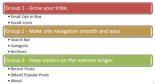
The first two in the list (Email Opt-in Box and Social Icons) clearly have the sole purpose – to grow your tribe. By the way, this is one thing you may want to consider adding to your sidebar.
The second group of widgets (Search Bar, Categories, and Archives) have a different task to solve, though. These widgets are there to make site navigation as smooth and easy as possible, “Cannot find it? Try to search it… Or maybe you may want to see the Categories… Or try my Blog Archives.”
The third group of Sidebar Widgets (Recent Posts, Popular Posts, About) tries to make the site more sticky, “Hey! That’s also interesting!” “Look! You might like this too,” “Wait a minute! Here are my most popular posts. People like them, you know. You wanna see?” etc.
Do you see the pattern?
Great. Next stop: How to arrange the sidebar widgets to get most out of them.
2. Website Sidebar Design – Best Way to Organize Widgets
That is what I thought:
Now that I know what widgets to include in my sidebar (and which ones to leave out), the question is: In what order should I arrange them?
Therefore, I said to myself, “Let’s analyze the data that had I collected.” (You know, I talk with myself :) )
I wondered what sidebar widget showed up in position #1 most. Which widget got the second place and which one won the bronze.
Then, which widgets won the gold, silver, and bronze medals in a sidebar position #2, etc.
This way, I planned to go until sidebar position #7. After that, everything is pretty much irrelevant.
This time, however, I decided to include all the ads too. Why? Because, of course, these ads occupy individual sidebar slots, and I can’t leave them out.
Read on and see what common trends come out.
Here’s what I got:
Sidebar Position #1:
- Email Opt-in Box – 16 times
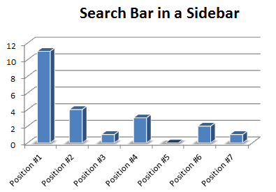
- Search bar – 11
- About – 8
- Social Icons – 6
- Ad – 5
- Popular Posts – 2
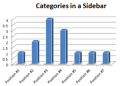
- Categories – 1
- Helpful Resources – 1
Sidebar Position #2:
- Email Opt-in Box – 10 times
- Ad – 10
- Social Icons – 8
- Search Bar -4
- About – 4
- Categories – 2
- Popular Posts – 2
- Helpful Resources – 2
- Recent Posts – 2
- Recent Comments – 1
Sidebar Position #3:
- Ad – 5 times
- Categories 4
- Recent Posts – 3
- About – 3
- Helpful Resources – 3
- Guides – 2
- Email Opt-In Box – 2
- Social Icons – 1
- Popular posts – 1
- Search – 1
- Recent comments – 1
- Tags – 1
Sidebar Position #4:
- Ad – 9 times
- (Most) Popular Posts – 4
- Search – 3
- Categories – 3
- Social Icons – 3
- Recent Posts – 2
- Helpful Resources – 2
- Archives – 1
- Recent Tweets – 1
Sidebar Postion #5:
- Ad – 9 times
- Most Recent Posts – 4
- Social Icons – 4
- (Most) Popular Posts – 3
- Archives – 3
- Videos (ad) – 3
- Gudes – 2
- About – 1
- Categories – 1
- Recent Tweets – 1
- Contact – 1
Sidebar Postion #6:
- Ad – 5 times
- Social Icons – 3
- Helpful Resources – 3
- Search bar – 2
- Guides – 2
- Archives – 2
- Recent Posts -2
- Videos (ad) – 2
- Categories – 1
- Contact Me – 1
- Recent Tweets – 1
Sidebar Postion #7:
- Ad – 4 times
- Archives – 4
- (Most) Popular Posts – 2
- Guides – 2
- Search – 1
- Categories – 1
- Social Icons – 1
- Videos (ad) – 1
- Recent Posts – 1
- Helpful Resources – 1
From this data you should be able to assemble as effective sidebar as it’s probably possible.
Let me give it to you graphically. Just for some of the most critical sidebar widgets:
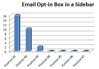
See! Email Opt-in is mostly in position 1 or 2.
![]()
Social Icons are mainly in a position 2 or 1 but can also be in the lower positions (4, 5, or 6).
And finally, what about ads?
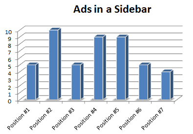
Lastly, one more thing:
3. How Many Sidebar Widgets You Should Include
From my research, I found the following:
The top 50 social media power influencers and the other 21 top-notch blogs have 6.25 sidebar widgets on average. Let’s round it down to 6 widgets per sidebar.
Now, here’s how it looks like:
- Sidebars with one widget: 1
- Sidebars with two widgets: 3
- Sidebars with three widgets: 2
- Sidebars with four widgets: 6 – 3rd Prize!
- Sidebars with five widgets: 11 – Winner!
- Sidebars with six widgets: 9 – 2nd Prize!
- Sidebars with seven widgets: 5
- Sidebars with eight widgets: 3
- Sidebars with nine widgets: 6 – 3rd Prize!
- Sidebars with ten widgets: 0 (zero)
- Sidebars with eleven widgets: 4
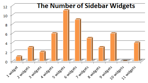
See! Most tested sidebars have 5 to 6 widgets. Then come those with four and nine widgets. Then everything else.
Conclusion
For this blog post, I researched and analyzed all the blogs of the top 50 Social Media Power Influencers and 21 additional other top-notch blogs recommended by Forbes.
Some clear trends emerged from that research. You will learn what are the most important widgets to include in your sidebar, how to arrange the widgets to get most of them, and how many widgets to add in the sidebar.
Imagine for looking for legit work-from-home opportunities and finding THIS when you go inside… WOW
Yes, the raw, sizzling beauty of passive income stream online… Please click now. Because sometimes ‘later’ becomes ‘never .‘
What About You?
What do you think about sidebars? Do you agree with the findings above? Please leave me a comment below.




 ARE YOU looking for ways to create a legit passive income online?
As someone who runs a blog type website, I found your article most interesting. I may have to do a little rearranging as a result. I really appreciate all the research you’ve done on this, it helps greatly. What is the big advantage of the email spot in the sidebar? Are you gathering email addresses to sell to product marketers?
Thank you, Jim, for taking time for the feedback. Yes, it took my quite a time to do the research. But I found it was well spent. As for the email spot in the sidebar, well it is to collect more emails and turn random visitors into permanent members of your “club.”
But as for me, I have not set up an email list yet. That’s the reason I don’t have that in my sidebar. Somewhere in the futures (sooner, rather than later) I will set it up and then I will add it to my sidebar too. :)
Hey Egon:
Thanks for sharing the results of your sidebar study. Fascinating! I especially liked your dividing up the assorted widgets and such by PURPOSE — tribe growth,
navigation aids and stickiness/engaging visitors.
Your post is making me re-think my sidebar use and that is a good thing. I think I’ll go visit the sites you’ve pointed out. They will be worth studying further, I am sure.
This is some great information and something I have never thought about to much. The sidebar is a very crucial spot and I am going to add a contact in mine as a result of your blog. I may even do some tweaking to watch site usage more. Thank you so much for a great article and the hard work you put into it.
Hi Ted,
Thank you for the feedback. I am happy to hear you found the blog post useful. By the way, I checked your site. It’s a great site indeed. And well organized sidebar. Not much to change :)
A really interesting and informative post.
I’m in the initial stages of creating my website and looking at the layout design. I hadn’t thought about the significance of where your sidebar is, but it does make sense to have it on the right as this is where you generally navigate and scroll down the page from.
The information you have provided has definitely made me think about the best choices for my own website.
I’ve actually just bookmarked to come back to later and refer to.
A website sidebar is significant indeed. Also, I am happy if you found the article useful for you. These findings are definitely useful for me. One day I want to test my site without a sidebar but at the moment I have decided to keep it.
And thank you for the feedback, Emma,
Egon